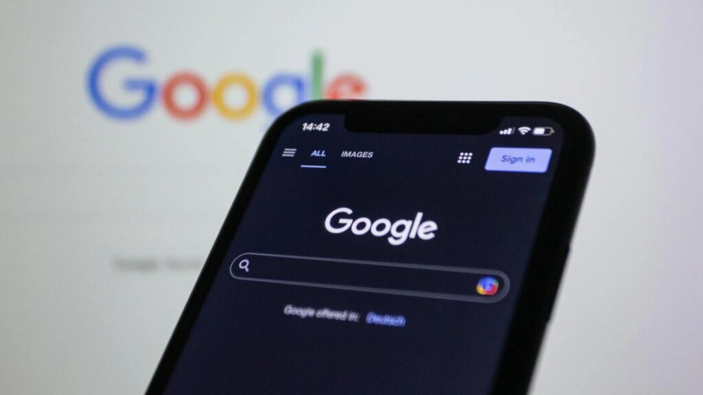
Most of us scroll through the phone during bedtime and read or watch whatever interests us. If the screen’s blinding white glow gets into our eyes accidentally, you know how vital the ‘Dark Mode’ setting is.
Dark mode isn’t new, but in the last few years, it has become extremely common in most websites, user interfaces, and apps. It is now hard to imagine that there wasn’t an option like this.
Many smartphone and tablet users look for dark mode to be turned on, as it feels better to the eyes. This is especially true if the daily usage is more than 5 to 6 hours.
We explore in detail why dark mode is necessary in 2025 and what options small businesses have to implement it on their digital portals.
Why Dark Mode?
Various scientific studies provide insights into how dark mode can affect users. One recent study examines how constant bright lights on smartphones affect the body’s circadian rhythm. It also studies how light blue colors result in eye strain and headaches for the user. These studies provide a backdrop for how dark mode became popular among users.
As web designers, ignoring this trend means missing out on a critical opportunity to connect with the modern audience. This is especially true for small businesses, where the only point of contact is the online app or website.
The Dark Mode Evolution
Dark mode isn’t a fleeting trend or some new fad. It is rooted in user behavior and technological evolution.
Users spend much more time in front of digital devices, laptop screens, smartphones, and tablets. In 2024, the daily average smartphone usage in the U.S. was over 3 hours, according to Statista.
If we combine it with laptop usage at work, many users are likely spending 7 to 8 hours in front of screens. This dramatically impacts the eyes, making it a rising concern among professionals. Dark mode helps reduce eye strain by eliminating bright blue colors and focusing on dark and yellowish hues. The fact that 80 to 90 percent of the screen is dark makes it clear that the eyesight will be helped.
The other major factor is that dark backgrounds consume less power than bright blue and white screens, especially on OLED and AMOLED screens.
Designing the Dark Mode
Dark mode isn’t about covering everything with a black background. It is about clarity. If the letters a user reads are faint or lack contrast, there is zero clarity, even in dark mode.
Ensure the text stands out against dark backgrounds. Harsh white texts are often overused, and it is better to go for soft grays to reduce glare. Hocoos recommends using an AI website builder with customization options to choose the right colors.
The good thing about using these builders is that you can create a website in a few minutes. All you need to do is to answer a few questions and you are good to go, with a site that replicates your vision.
It’s a good idea to test the design on different devices. It may look perfect on your computer but appear glitchy on a phone. Testing it on different browsers also helps.
For instance, Netflix does this contrast well by using a consistent black background across all platforms. This ensures that the user always sees the same sleek interface.
Small businesses can use this to their advantage. If something looks off in your tests, tweak it.
Let the Users Decide
Dark mode is good for the eyes and for the device’s battery, but it’s not something that every user wants. Some people also prefer the light mode. Give users a toggle or a switch to manually change the theme to dark or light. Better yet, let the system decide.
Many users like their devices to auto-switch to dark mode after sunset. It’s a familiar setting on iPhones as well. It’s like setting the thermostat to adjust automatically. You don’t have to think about it.
Dark Mode for Accessibility
Dark mode isn’t just for people who like to use their mobile at night or in dim surroundings. It is a must for people with light sensitivity and dyslexia.
Online users favor websites with accessibility features. These websites also rank higher in search engine rankings, as more users will be helped.
Adjustable font sizes and image descriptions add to the accessibility factor. Just like movie subtitles are appreciated as they make content accessible to a diverse set of people, so are these features.
Small businesses can benefit from this as their usage is positively affected by implementing these features.
Dark Mode for the Modern User
Dark mode is no longer a niche feature but an essential element of modern web design. By focusing on accessibility, energy efficiency, and user preference, designers can create experiences that resonate with today’s audiences.
The key is balancing aesthetics with functionality. As technology advances, dark mode will continue to shape how users interact with digital spaces. Embrace it, and your designs will stand out, not just in the dark but in the light of user expectations.