A wallpaper can change the feel of a device in seconds. Open your phone or laptop, and the background sets the mood before you tap a single app.
That is why AI wallpaper creation has caught on so fast. It gives regular users a way to make something personal without needing advanced design skills, expensive software, or hours of editing.
You do not need to be an artist to get a result that feels polished. You need a clear idea, a few smart choices, and a basic sense of what works on screens.
Why AI Wallpapers Feel So Appealing
People want backgrounds that look like their space, taste, and mood. Stock wallpapers can look nice, sure, though they often feel generic after a day or two. AI changes that by letting you describe a scene, style, or vibe in plain language and turn it into something original.
That matters because wallpapers are not just decoration. They sit behind everything you do on a device. A good one can make a screen feel calmer, sharper, warmer, cleaner, or more playful.
AI tools also lower the barrier for people who have ideas but no design training. For anyone who wants a faster starting point, a browser-based wallpaper maker can remove a lot of the friction.
What Makes a Good Wallpaper
A wallpaper is not the same as a poster, social graphic, or desktop illustration. It has a job to do. It needs to look good while staying out of the way.
Here is what usually matters most:
- Clean composition
- Enough empty space for icons or widgets
- Colors that do not make text hard to read
- Sharp details in the right areas
- A size and crop that fit your screen
A background can be gorgeous and still fail as a wallpaper if the main subject lands right behind your clock, app labels, or folder stack.
Quick Rule of Thumb
If your first reaction is “nice image,” that is only step one. If your second reaction is “I can still read everything on my screen,” now you are getting somewhere.
Start With a Clear Visual Direction
Before typing anything into an AI image tool, decide what kind of wallpaper you actually want. People often skip that part, then wonder why the results feel random.
Ask yourself:
- Do you want calm or high energy?
- Minimal or detailed?
- Light tones or dark tones?
- Nature, abstract art, futuristic city, soft gradient, anime-inspired scene, retro collage, or something else?
- Phone lock screen, home screen, tablet, or desktop?
A dark lock screen with one glowing element needs a very different prompt than a busy desktop background meant for a large monitor.
How To Write Prompts That Produce Better Wallpapers
Prompt writing does not need to be fancy. It needs to be specific. Vague prompts usually lead to vague images.
Look at the difference below.
| Weak Prompt | Better Prompt |
| blue background | soft deep-blue ocean-inspired wallpaper, subtle gradient, glowing moon reflection, minimalist composition, vertical phone format |
| forest | misty pine forest at dawn, muted green palette, soft light rays, cinematic atmosphere, space at top for clock |
| futuristic city | neon futuristic skyline at night, purple and cyan lighting, rainy streets, reflective surfaces, clean center area for app icons |
The stronger version gives the AI more to work with: subject, mood, color, lighting, and layout.
Prompt Formula That Works Well
Try building prompts in layers:
Subject + Style + Color Palette + Lighting + Composition + Device Format
Example:
desert dunes, painterly style, warm peach and sand tones, golden sunset light, minimal foreground detail, widescreen desktop wallpaper
That structure keeps you focused and cuts down on messy results.
Think Like a Designer, Not Just a Prompt Writer
A good AI wallpaper usually comes from design decisions, not magic words. You are still directing the result.
Pay attention to a few design basics:
1. Leave Breathing Room
If icons will sit on the bottom half of your home screen, avoid heavy detail there. Ask for open space, soft blur, or a clean gradient in that area.
2. Control the Focal Point
Put the most important object away from clocks, widgets, or app labels. On phones, the upper center often gets crowded. On desktops, icons often sit along the edges or one side.
3. Keep Contrast in Check
Super bright, high-detail images can make screens feel noisy. A slightly muted palette usually holds up better over time.
4. Match the Device Mood
For work laptops, many people prefer low-distraction backgrounds. For tablets or personal phones, more expressive art can work beautifully.
Best Types of AI Wallpapers for Beginners
Some styles are easier to get right on the first try. If you are new, start there.
Minimal Gradients
Simple, clean, and easy on the eyes. Great for phones and desktops where readability matters.
Nature Scenes With Soft Depth
Clouds, mountains, waves, forests, desert landscapes. AI tends to do well with atmospheric scenery, especially when prompts mention lighting and mood.
Abstract Shapes and Color Washes
Perfect if you want something modern without worrying about realistic details or weird AI anatomy.
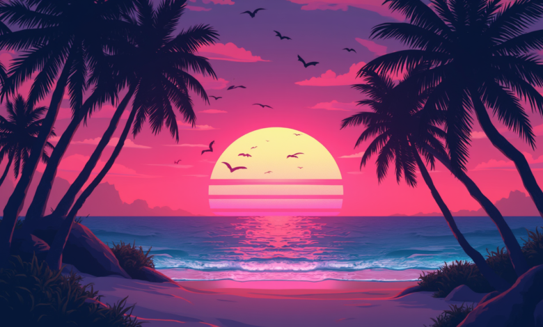
Space and Cosmic Themes
Stars, planets, nebula clouds, moonlit scenes. Very popular for wallpaper use because empty space looks intentional.
Illustrated Mood Scenes
Cozy rooms, rainy windows, dreamy city streets, glowing cafés, soft fantasy landscapes. Good choice for users who want personality without visual clutter.
Common Mistakes That Make AI Wallpapers Look Off
A lot of bad wallpaper results come from a few repeat issues.
- Too much detail everywhere
- Subject placed right behind icons
- Colors that clash with app labels
- Wrong aspect ratio
- Faces or hands included for no real reason
- Overloaded prompts stuffed with too many styles
One more thing: avoid trying to force ten ideas into one image. “Cyberpunk forest beach temple galaxy samurai neon sunset” usually ends in chaos.
How To Edit the Result So It Actually Fits Your Screen
Even a strong AI image may need a little cleanup. A basic edit can make a huge difference.
Crop for the Device First
Designing for a phone? Use vertical framing. Desktop? Go horizontal. Tablet? Somewhere in between depending on orientation.
Blur Busy Areas
If the center or bottom gets too detailed, a slight blur can help icons stand out.
Lower Saturation a Bit
Many AI images come out overly intense. Pulling back saturation by a small amount often makes a wallpaper feel more expensive and easier to live with.
Add a Soft Overlay
A subtle dark overlay can help lock-screen text pop. A gentle warm tint can also make a wallpaper feel more cohesive.
Sample Wallpaper Ideas You Can Try
If you want a faster starting point, use ideas like these and tweak them to match your taste:
- Cozy rainy Tokyo alley, warm lantern glow, reflective pavement, vertical phone wallpaper
- Minimal sand dunes, soft beige palette, sunrise lighting, clean lock screen composition
- Deep green forest canopy, misty morning light, calming tablet background
- Abstract liquid shapes, muted lavender and slate tones, modern desktop wallpaper
- Night sky with moon and thin clouds, dark navy palette, space for clock and widgets
- Mediterranean window view, bright white walls, soft blue sea, airy laptop background
Each one gives the AI a clear scene, mood, and use case.
A Simple Workflow That Saves Time
You do not need a complicated process. Keep it tight.
Step 1: Pick the Screen
Phone, desktop, tablet, or watch.
Step 2: Pick the Mood
Calm, bold, dreamy, moody, playful, sleek.
Step 3: Write One Clean Prompt
Start simple. Add only meaningful details.
Step 4: Generate a Few Versions
Do not stop at the first result. Small variation often leads to the best one.
Step 5: Edit for Real Use
Crop, soften, darken, or simplify where needed.
Step 6: Test on the Actual Device
A wallpaper can look amazing in preview and feel messy once icons land on it.
Final Thoughts
AI wallpaper creation works best when you treat it like creative direction, not random button pressing. A clear mood, a practical prompt, and a few thoughtful edits can turn a decent image into a background you actually want to keep.
Start simple. Pay attention to space, color, and screen layout. After a couple of tries, you will get a feel for what your devices need, and your wallpapers will start looking a lot more personal, polished, and intentional.